Metabolic Networks with Escher

In this tutorial, we will walk you through how to use Escher to contextualize metabolic activities with visualizations of metabolic networks.
“Escher is a web-based tool for building, viewing, and sharing visualizations of metabolic pathways”.
You can learn more in its paper or readthedocs. We strongly recommend this video of Escher in 3 minutes to learn how to use it.
This tutorial includes following steps:
Loading libraries
[1]:
import json
import sccellfie

import pandas as pd
import numpy as np
Loading endometrium results
We start opening the results previously generated and exported as shown in this tutorial.
In this case, we will load the objects that were present in results['adata'] in that tutorial. This object contains:
results['adata']: contains gene expression in.X.results['adata'].layers['gene_scores']: contains gene scores as in the original CellFie paper.results['adata'].uns['Rxn-Max-Genes']: contains determinant genes for each reaction per cell.results['adata'].reactions: contains reaction scores in.Xso every scanpy function can be used on this object to visualize or compare values.results['adata'].metabolic_tasks: contains metabolic task scores in.Xso every scanpy function can be used on this object to visualize or compare values.
Here, we will name this object directly as adata. Each of the previous elements should be under adata., as for example adata.reactions.
[2]:
adata = sccellfie.io.load_adata(folder='./results/',
                                filename='Human_HECA_scCellFie'
                               )
./results//Human_HECA_scCellFie.h5ad was correctly loaded
./results//Human_HECA_scCellFie_reactions.h5ad was correctly loaded
./results//Human_HECA_scCellFie_metabolic_tasks.h5ad was correctly loaded
Escher can visualize metabolic networks covering different metabolic tasks. However, to represent the activity of these tasks, we need the activity of the distinct reactions that compose them. In this case, they can be found in the adata.reactions AnnData object.
[3]:
adata.reactions
[3]:
AnnData object with n_obs × n_vars = 90001 × 748
    obs: 'n_genes', 'sample', 'percent_mito', 'n_counts', 'Endometriosis_stage', 'Endometriosis', 'Hormonal treatment', 'Binary Stage', 'Stage', 'phase', 'dataset', 'Age', 'lineage', 'celltype', 'label_long'
    uns: 'Binary Stage_colors', 'Biopsy_type_colors', 'Endometrial_pathology_colors', 'Endometriosis_stage_colors', 'GarciaAlonso_celltype_colors', 'Group_colors', 'Hormonal treatment_colors', 'Library_genotype_colors', 'Mareckova_celltype_colors', 'Mareckova_epi_celltype_colors', 'Mareckova_lineage_colors', 'Processing_colors', 'Rxn-Max-Genes', 'Symbol_colors', 'Tan_cellsubtypes_colors', 'Tan_celltype_colors', 'Treatment_colors', 'celltype_colors', 'dataset_colors', 'genotype_colors', 'hvg', 'label_long_colors', 'leiden', 'leiden_R_colors', 'leiden_colors', 'lineage_colors', 'neighbors', 'normalization', 'phase_colors', 'umap'
    obsm: 'X_scVI', 'X_umap'
    obsp: 'connectivities', 'distances'
Loading Escher maps
To visualize the distinct metabolic tasks, we need Escher maps that were previously created for this purpose. We provide maps for multiple tasks in this link where you can fin a series of json files containing the maps. These files can be downloaded into your local computer, which you will later use on the Escher website to visualize the metabolic activities. At the moment, these maps are available only for human
datasets.
We start loading the Escher map that contains metabolic tasks associated with the metabolism of amino acids.
[4]:
with open('amino_acid_metabolism.json') as f:
    escher_map = json.load(f)
We gather the reaction names contained in this map, which we will use later to filter our predictions with scCellFie.
[5]:
rxns = [d['bigg_id'] for d in escher_map[1]['reactions'].values()]
[6]:
len(rxns)
[6]:
305
Preparing Escher inputs
Here, we show three different approaches to prepare the inputs for Escher. Depending on our interest, we can use any of them:
We start with the reaction activities, directly calculated with scCellFie.
Alternatively, we show how to use these activities in a scaled manner by using the whole human cell atlas as reference for these values to put in context what are low or high activities.
Finally, we show how we can export values comparing conditions, where negative and positive values are associated with each of the compared conditions.
Direct activity of reactions
We can directly use the activity of the distinct reactions in the scCellFie’s database by first aggregating the single cells into a cell type level. Here we use the Tuckey’s trimean to summarize each reaction activity per cell type.
[7]:
agg_rxns = sccellfie.expression.agg_expression_cells(adata=adata.reactions, groupby='celltype', agg_func='trimean')
Then, we identify which reactions in our dataset are present in the Escher map that we previously loaded.
[8]:
included_rxns = [rxn for rxn in rxns if rxn in agg_rxns.columns]
len(included_rxns)
[8]:
172
We can specify one cell type at the time to inspect its activities. Here we use the Luminal cells, which are a subtype of epithelial in the endometrium.
[9]:
escher_data = agg_rxns.loc['Luminal', included_rxns].fillna(0).to_dict()
We finally export this activity to later load it in the Escher website.
[10]:
with open("./results/escher_data_Luminal.json", "w") as outfile:
    json.dump(escher_data, outfile, indent=4, sort_keys=False)
Scaled activity of reactions
Alternatively, we can scale the activity of each reactions by using the pre-computed min and max values across the whole CELLxGENE human cell atlas. We load these reference values from the GitHub hosting the scCellFie website.
[11]:
minmax = pd.read_csv('https://raw.githubusercontent.com/ventolab/sccellfie-website/refs/heads/main/data/CELLxGENEReactionsMinMax.csv', index_col=0)

# Subset reactions to only those that are present in our dataset
minmax = minmax[agg_rxns.columns]
Then, we take these min and max values to perform a minmax normalization to scale the values into a range between 0 and 1.
[12]:
scaled_rxns = agg_rxns.subtract(minmax.loc['cell_type_min', :], axis='columns')  / (minmax.loc['cell_type_max', :] - minmax.loc['cell_type_min', :])
scaled_rxns = scaled_rxns.clip(lower=0., upper=1.)
Again, we then select one cell type, in this case Luminal cells.
[13]:
scaled_escher_data = scaled_rxns.loc['Luminal', included_rxns].fillna(0.).to_dict()
We finally export this activity to later load it in the Escher website.
[14]:
with open("./results/scaled_escher_data_Luminal.json", "w") as outfile:
    json.dump(scaled_escher_data, outfile, indent=4, sort_keys=False)
Differential activity of reactions
If we are interested in identifying activities changing between conditions, we can perform a differential analysis at the reaction level (instead of the metabolic task level as shown in our general overview tutorial) and export the fold changes (or Cohen’s D score) to easily distinguish activities associated with one condition or the other.
This dataset contains samples associated with endometriosis and control.
[15]:
adata.obs.Endometriosis.unique()
[15]:
['Control', 'Endometriosis']
Categories (2, object): ['Control', 'Endometriosis']
We define our conditions to compare, where the first one is used as reference. An indicate the column where this information is contained.
[16]:
contrasts = [('Control', 'Endometriosis')]
condition_key = 'Endometriosis'
For this tutorial, we will focus only on Luminal cells. So we filter our dataset to include only these cells, and contain only the reactions that are present in the Escher map we loaded.
[17]:
test_adata = adata.reactions.copy()
test_adata = test_adata[test_adata.obs.celltype == 'Luminal', included_rxns]
This results in a subset of ~ 3k Luminal cells, and 172 reactions.
[18]:
test_adata.shape
[18]:
(2942, 172)
Then we perform the differential analysis using the Wilcoxon test in scCellFie.
[19]:
dma = sccellfie.stats.scanpy_differential_analysis(test_adata,
                                                   cell_type=None,
                                                   cell_type_key='celltype',
                                                   condition_key=condition_key,
                                                   min_cells=20,
                                                   condition_pairs=contrasts)
Processing DE analysis:   0%|          | 0/1 [00:00<?, ?it/s]/home/jovyan/my-conda-envs/single_cell/lib/python3.10/site-packages/sccellfie/stats/differential_analysis.py:39: RuntimeWarning: invalid value encountered in scalar divide
  d = (mean2 - mean1) / pooled_std
Processing DE analysis: 100%|██████████| 1/1 [00:03<00:00,  3.17s/it]
Which results in the following dataframe:
[20]:
dma.head()
[20]:
| cell_type | feature | group1 | group2 | log2FC | test_statistic | p_value | cohens_d | n_group1 | n_group2 | median_group1 | median_group2 | median_diff | adj_p_value | |
|---|---|---|---|---|---|---|---|---|---|---|---|---|---|---|
| 0 | Luminal | TKT2 | Control | Endometriosis | 1.488377 | 11.502789 | 1.277202e-30 | 2.075280 | 2871 | 71 | 0.4106477963907158 | 1.4828520991382361 | 1.072204 | 1.098393e-28 |
| 1 | Luminal | TKT1 | Control | Endometriosis | 1.488377 | 11.502789 | 1.277202e-30 | 2.075280 | 2871 | 71 | 0.4106477963907158 | 1.4828520991382361 | 1.072204 | 1.098393e-28 |
| 2 | Luminal | GAPD | Control | Endometriosis | 0.508739 | 10.883880 | 1.375795e-27 | 1.714388 | 2871 | 71 | 6.377502975157647 | 9.10553057837871 | 2.728028 | 7.887890e-26 |
| 3 | Luminal | ENO | Control | Endometriosis | 1.087755 | 10.388724 | 2.790609e-25 | 1.678669 | 2871 | 71 | 1.6954213931183895 | 3.698023241259177 | 2.002602 | 1.199962e-23 |
| 4 | Luminal | LDH_Lm | Control | Endometriosis | 0.678056 | 10.307401 | 6.524223e-25 | 1.768239 | 2871 | 71 | 1.2406285884712251 | 2.103329791976264 | 0.862701 | 2.244333e-23 |
Our reactions are contained in the column feature, and we can use the Cohen’s D (cohens_d column), which represents a standardized difference of the group means that is robust to outliers. In this case, as we used Control samples as reference, positive values are associated with Endometriosis, while negative values are related to Control.
[21]:
diff_escher_data = dma.set_index('feature')['cohens_d'].fillna(0).to_dict()
We finally export this activity to later load it in the Escher website.
[22]:
with open("./results/diff_escher_data_Luminal.json", "w") as outfile:
    json.dump(diff_escher_data, outfile, indent=4, sort_keys=False)
Online visualizations
1. Access Escher website
As a first step to visualize scCellFie’s metabolic activities inferred using Escher, we access the Escher website.
Here, we immediately click on Load map, regardless of the organism, map, and model:
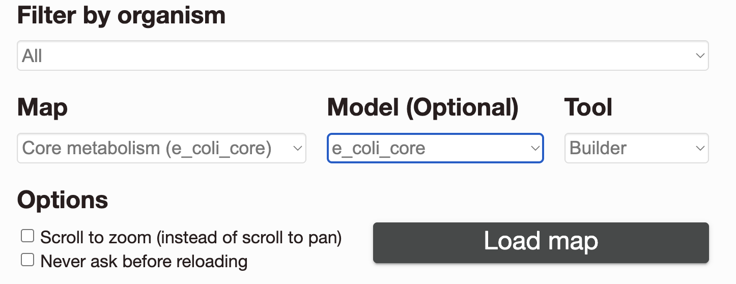
Which will take us to the following screen:
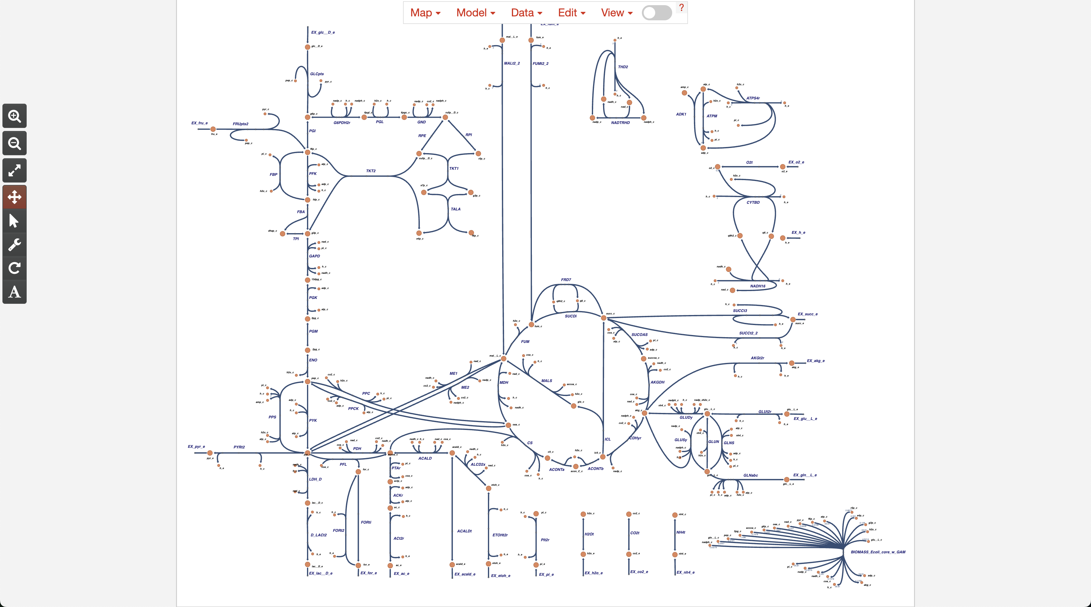
2. Load Escher map containing metabolic tasks
On this first screen, there is a menu on the top area. Here, we click Map, then on Load map JSON.
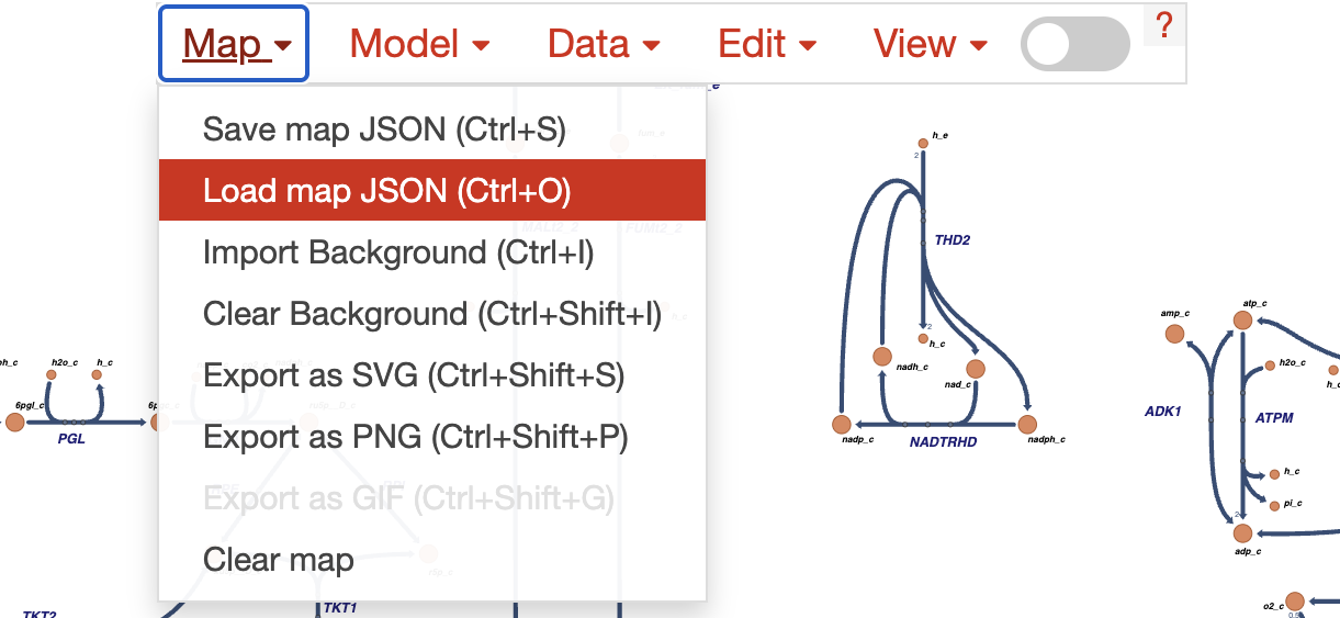
After that, we will be requested to upload a JSON file with our Escher map. In this case we load our amino_acid_metabolism.json that we downloaded from the scCellFie GitHub.
Note!
If you decide to use a different Escher map from our GitHub, make sure that you run all code in the previous sections of this notebook, making sure to replace the path in the Loading Escher maps section to generate the pertinent Escher inputs that are linked with that map!
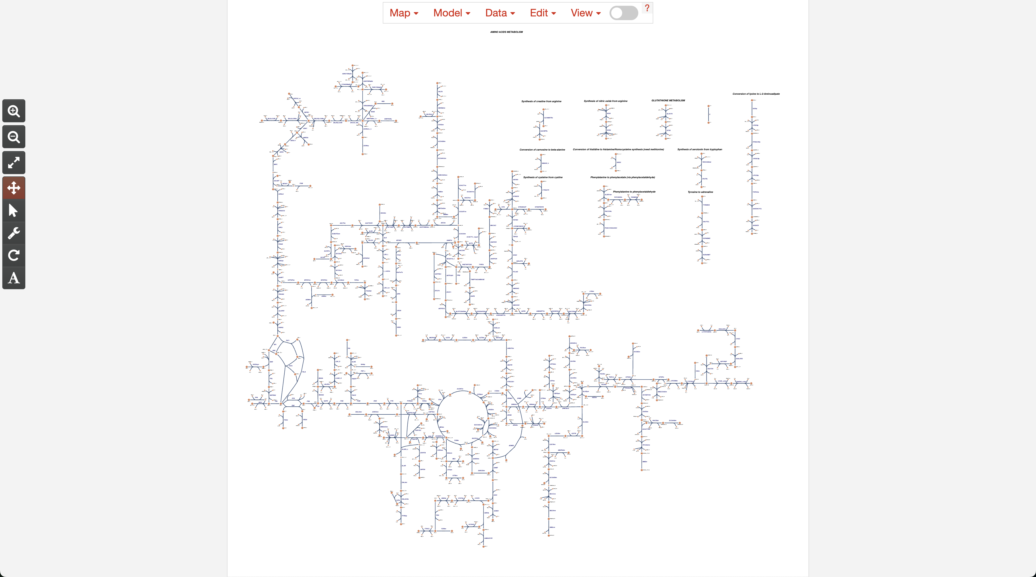
After loading the map, we should see it as in the following screenshot:
3. Load input data into Escher
After loading our Escher map, we can load the metabolic activities for the reactions in this map that were present in our dataset.
For the purpose of this tutorial, here we will load the differential activities of the Luminal cells between Control vs Endometriosis (stored as diff_escher_data_Luminal.json). For that, we click on the Data in the top menu, then on Load reaction data. Make sure to clear previous loaded data by first clicking on Clear reaction data.
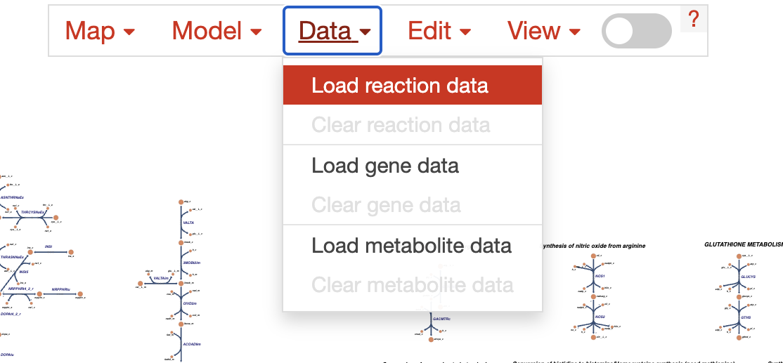
Which will show us a screen that looks like this:
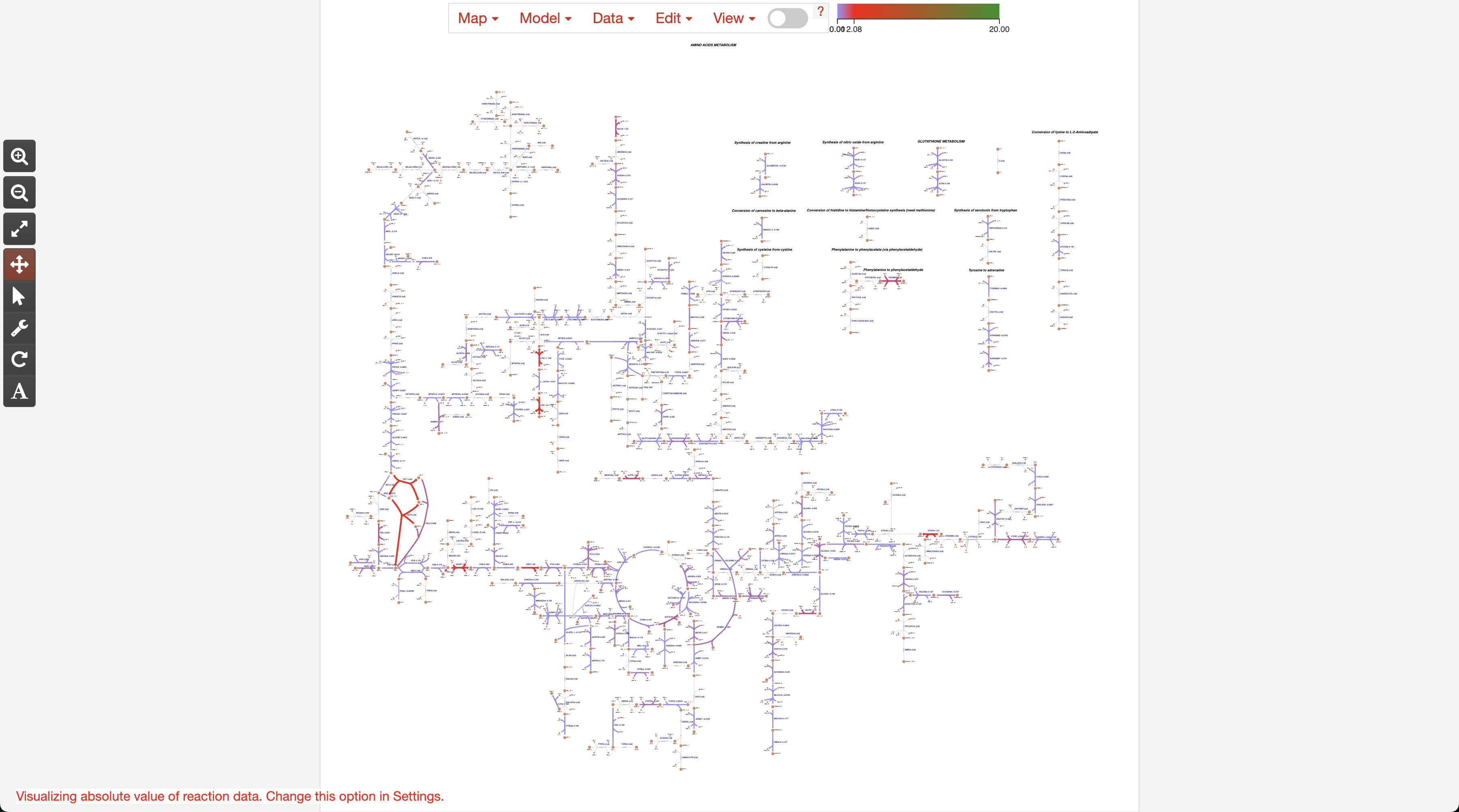
4. Setting up colors
Once we have loaded our reaction activities, you can see that the colors are not properly set. For doing that, we need to open Settings by clicking on View, followed by Settings.
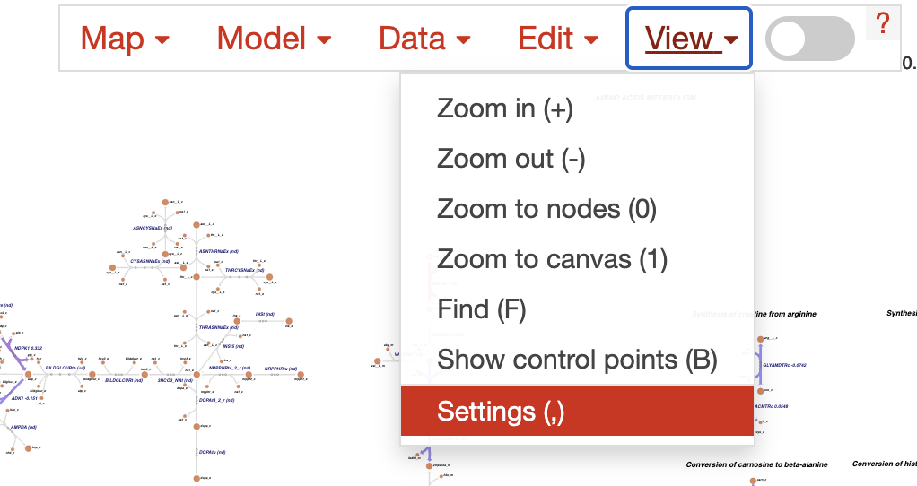
This will take us to the following window:
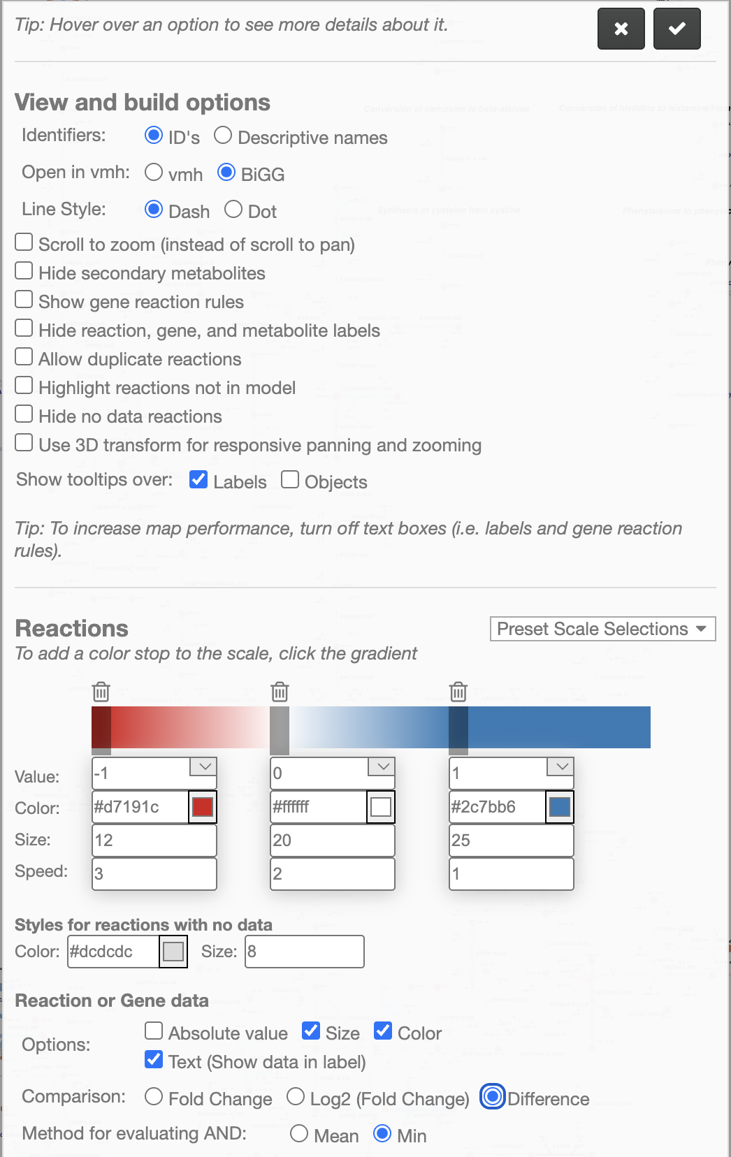
Note!
Here, we first need to uncheck Absolute value at the bottom (Options), select Difference (Comparison) because we are using the Cohen’s D score, and click on Min (Method for evaluating AND).
After that, we can change the colors in the color bar. Considering that important Cohen’s D scores could be either -1 or 1 (for down- or up-regulations), you can see that we split the color bar in three color stops to represent -1, 0, and 1. Here, we start setting the value of -1 to the Red color (representing Control), followed by the value of 0 set to White (representing no changes between conditions), and the value of 1 set to the Blue color (representing Endometriosis).
5. Final visualization
Finally, after setting up the colors, we can see the Metabolic Network of the amino acid metabolism, indicating which reactions are up-regulated (more activity in Endometriosis, represented in Blue), or down-regulated (more activity in Control, represented in Red). You can explore this network using the controls or icons at the left.
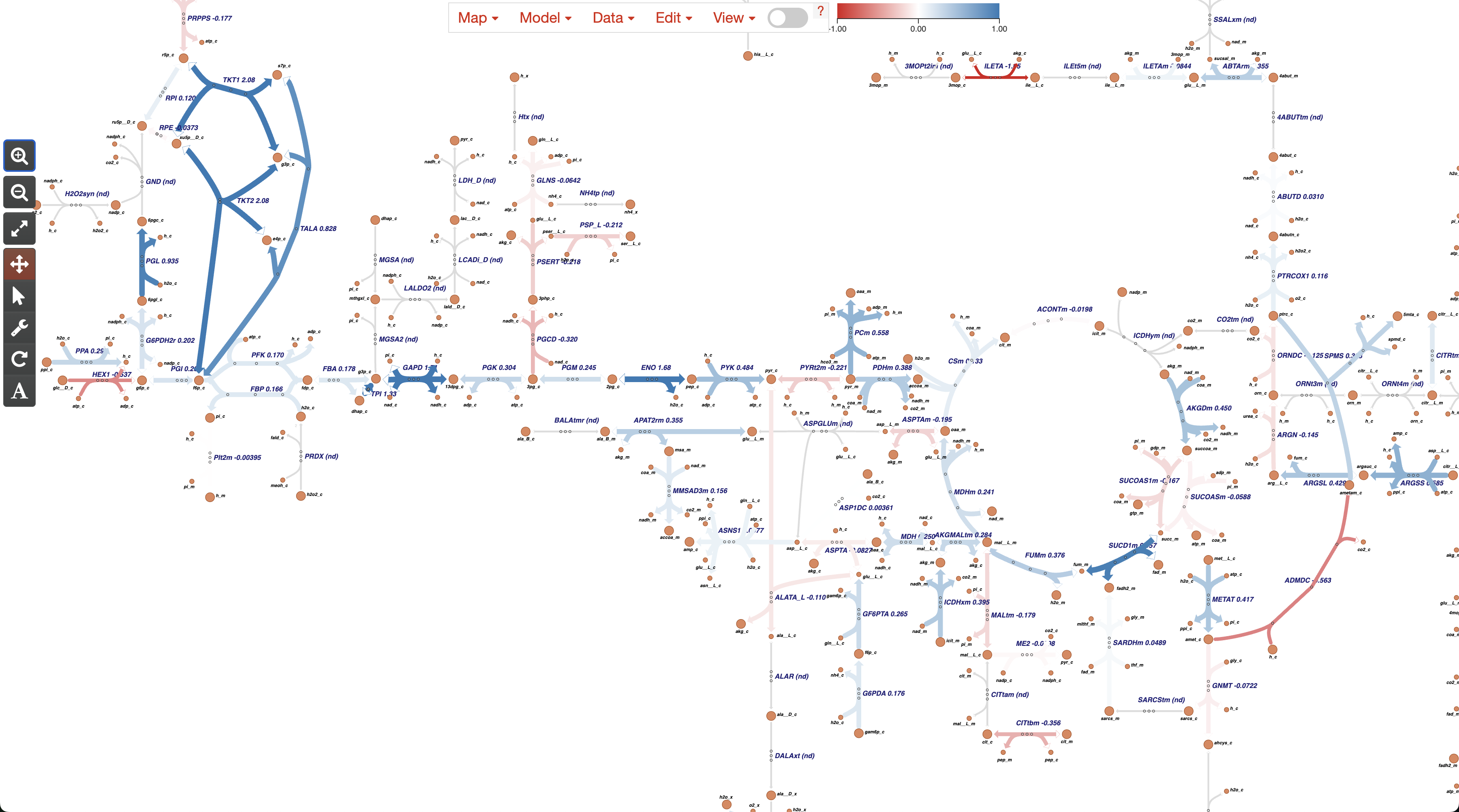
Optionally, we can load any of the other Escher input we generated:
escher_data_Luminal.jsoncontaining the direct activity computed by scCellFiescaled_escher_data_Luminal.jsoncontaining the scaled activity computed by scCellFie, with respect to the min and max values found in the CELLxGENE human cell atlas.